Overview
The Overview dashboard gives you a real-time snapshot of engagement activity across your workspace. It combines KPI metrics, an activity heatmap, lead distribution, and top-performer lists into a single view so you can spot trends at a glance.
What You'll See
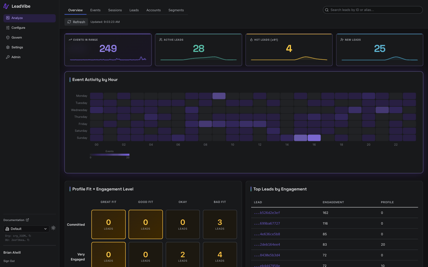
KPI Strip
Four hero cards at the top show headline metrics for the selected time range:
| Metric | Description |
|---|---|
| Events in Range | Total number of events ingested during the period |
| Active Leads | Unique leads that generated at least one event |
| Hot Leads | Leads whose engagement score meets or exceeds the highest engagement level threshold |
| New Leads | Leads created during the selected range |
Each card includes a sparkline showing the metric's trend over time, making it easy to spot upward or downward movement without navigating elsewhere.
Event Activity by Hour
A full-width heatmap showing event volume broken down by day of week and hour of day for the last seven days. Darker cells indicate higher activity. Use this to identify:
- Peak engagement windows -- when your audience is most active.
- Quiet periods -- potential times for outreach or campaign sends.
- Anomalies -- unexpected spikes that may warrant investigation.
Profile Fit x Engagement Level
A matrix that cross-references your configured Engagement Levels (rows) with Profile Levels (columns). Each cell shows how many leads fall into that combination, helping you answer questions like:
- How many high-fit, high-engagement leads do we have?
- Are there well-fitting leads with low engagement that need nurturing?
- Where is the biggest concentration of leads?
Top Leads by Engagement
A ranked list of leads with the highest engagement scores. Click any lead to jump directly to their detail page and review their full activity timeline.
Biggest Score Gains (7d)
Leads that experienced the largest score increases over the past seven days. These are prospects showing a sudden uptick in interest and may be ready for outreach.
Most Active Accounts
Accounts ranked by recent activity volume. Useful for Account-Based Marketing workflows where you want to identify which target accounts are engaging most.
Toolbar Actions
- Refresh -- Manually reload all dashboard data. The dashboard also auto-refreshes every 15 minutes when the browser tab is active.
Time Range
The dashboard respects the global time range selector. Changing the range updates all KPI cards, the heatmap, and trend sparklines accordingly.
Best Practices
- Check the overview daily. A quick glance at the KPI strip tells you whether engagement is trending up or down.
- Use the heatmap for campaign timing. Schedule emails and outreach during peak activity windows.
- Monitor the matrix. Leads in the high-fit / low-engagement quadrant are prime candidates for targeted campaigns.
- Follow up on score gains. A lead whose score jumped significantly in the last week may be actively evaluating your product.